Web 2.0 – What is it?

There are many different defininitions of what Web 2.0 actually is, however, it is basically the second stage of the internet (hence the name). Often characterized by the metamorphasis from static based webpages to dynamic and/or user generated, open source content and the growth of social networking. It promotes the idea of an online, interactive community and invites the idea of user contribution.  Web v.1 is often classed as a very passive, uninteractive and static.

Examples of Web 2.0 based websites are: WordPress and other blogs, Facebook, LinkedIn, Twitter, video sharing sites, and Pinterest.

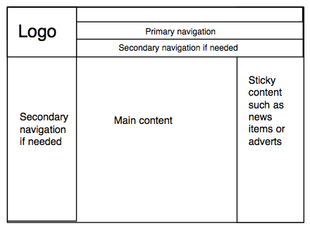
I found an image online that I feel simply sums up what Web 2.0 is compared to Web 1.0:

Web 1.0 vs. Web 2.0

Basically is it a lot more organised, simplified and user based community.

Facebook

To make a successful Web 2.0 page I think it should include the following:

1. Centralised layout

2. Simplicity

3. Easy navigation

4. Strong colours

5. Gradients

6. Icons, Badges

7. Big bold colours

8. Bold introductions/big text

9. Rounded edges

10. Sans Serif types

I’m not saying this is everything a website should include but I feel these are most the most important things for a memorable website.

Image Bibliography:

1 – lauradrazek.wordpress.com

2 – Facebook.com

Wireframing Templates

In this blog post I will include a couple of templates that are standard templates used when designing a website. They are quite basic and simple but can be extremely effective if carried out efficiently. I will be using these as basic ideas for my website, however I do not wish to copy them, but I do plan on taking certain elements from each when designing my web interfaces. In the next blog post I will post a few pictures of wireframing designs I am going to draw out and hopefully a spider diagram displaying the layout of a generalised website for a creative.

Basic template 1  - phil

Basic template 2 - phil

Wireframing templates designed by Phil Jackson

Mood Boards

I decided to put together a few mood boards of inspiring fonts, logos and navigational bars. As I think mood boards are great ways of showing your research and development when designing an idea. Especially with something as visual as designing a webpage.

Logos

Image

A logo is probably the second most important aspect of a brand and website (behind content), if not the most important aspect of the brand. It is often what will draw the client in, or turn the client off. It can say a number of things about the brand – it can connote a relaxed, easy to use company or a complex and unwelcoming one. One of the main similarities between them is that they are simple; when designing a logo simplicity is nearly always key to creating a successful one.

Here I’ve picked a few of my favourite logos that have inspired me in creating my own logo.

Fonts

Image

I think the font used in an interface is a really important aspect of a brand, website and logo; it’s one of the first things a possible client will notice and can convey a lot about the website and the brand. Here I have picked a few fonts that I like and that apply to the brand image I am trying to display. I also wanted the fonts chosen to stand out as something different to the standard choices of fonts often used online and I think I have done that.

When designing my interface I may use a couple of different fonts; I was thinking a slight differentiation in font for ‘ether’ and ‘real’ in the logo, but I’m not sure if it will look good or not so I will have some experimentation.

Navigation

Image

Navigation is another key element when designing and creating a website. Buttons are also a major defining point for a website as that is what the user will be clicking on (most of the time), to navigate around a website. Buttons need to be simple but also punchy, as you need to know they’re there so the user can find their way around the site. However, it is important not to over complicate as this can send the user into confusion. I find the ones with white backgrounds often work the best as they stand out the most.

I’ve picked out a few of my favourite navigation interfaces from various websites, some of them are from photographers websites and others are just random interfaces I have come across when trawling the Internet.

Navigation buttons bibliography: bjp-online.com, joshredman.co.uk, antro.ca, audreyazoura.fr, cambrianhouse.com, chasejarvis.com, from-the-couch.com, auberge-de-l-ill.com, narrowdesign.com, theoatmeal.com, paulunderhill.com, powertotheposter.org, realitypod.com, riotindustries.com, robertjwilson.com, stevemorganphoto.co.uk, store.hipstery.com, tripplanner.travelalberta.com, vllg.com, wallbase.cc, yeedor.com

MoodBoard 1

My idea is related to cyborgs and how humans are slowly merging with technology. Often people have the desire of becoming immortal or living longer, and that is now at least partly possible, if not completely, with the technology we have nowadays. So in this project I will be tackling those issues, looking at the rise in use of technology in place of nature and asking people the question; should we really be going as far as attempting immortality?

Here’s a mood board I created before I had decided on an idea. It includes a few surreal digital edits of photographs that inspired me before I came across the idea of cyborgs. It is still relevant however, as it has some relation to cyborgs and mergence with technology.

The central image by Ronen Goldman – to me – implies there are many clones, e.g cyborgs. The woman without the goggles on seems to me like she is a human and is running away from the cyborgs, kind of like you might see a zombie appocalypse happening in movies but instead of the zombies they are robots. They all make me question what is real and what is not, making me think about human and technology therefore bringing reference to my project idea.

Mood board

Artist list from left to right: El Lissitzky – self portrait, Joel Robison, Vincent Bourilhon, Kristina Dyachenko, Ronen Goldman, Joel Robison, Joel Robison, Erik Johansson, Laura Drazek & Ronen Goldman.

Use of colour

Use of colour is an important aspect when designing a brand and website as it influences the overall feel and view of the interface. In psychological terms, colours have very diverse meanings; this is because they convey certain feelings as they are associated with different things in various cultures and the natural environment.

I have included a table of colours and their perceived meanings:

Image

I decided to create a group of mood boards I have created in Photoshop specifically colour coded to fit the colours I have spoken about above. I created these because I want the user to get a feel of how different colours can make someone feel and as I’ve said in a previous post – I think mood boards are a really interesting and extremely visual way of displaying ones ideas and influences. I gathered all the images using an image search tool called ‘TinEye’, that searches Flickr according to your colour selections. I have also made sure I reference all the images I have found to the artists that made them and check that they allow reposts of their images in their image permissions.

Bibliography:

Mood board 1 – Andrea Chiu, badjonni, Ben Cooper, Carol Von Canon, Chris Van Pelt, Colnik, Dan Zen, Eldan Goldenberg, Erik K Veland, James Cridland, Joachim Niemeier, Kappuru, Marko Kivelä, Meg_Nicol, Ricin, Sean Barnard, Slashcoconut, Tom Burke, Tony Wu, Vicki Lackey, Yersinia Pestis.

Mood board 2 – Dale Carlson, Pchweat, Mama Hiro, Tanita Tsunami, Carlos Benayas, Gary A. K., John Ryan, Guilherme Meneghelli, Carolyn Hall, Alejandro Polanco, Patrick Lauke, Bob Shand, Juan Antonio Zamarripa, 懋, Raminsky, Renzo Borgatti, Vanessa Pike-Russell, Tom Parnell, Kanaka Menehune, Sato Sugar, Éole Wind, Piers Cawley, pingnews.com, _bruno_ , Alain Bachellier.

Mood board 3 – Corin Royal Drummond, Eric Lewis, Fdecomite, Graela, Hellabella, Icanteachyouhowtodoit, JR_Paris, Mark Skipper, Melanie Cook, Moderntime, q8, Roger Smith, Sally Payne, Shawn Ford, Sporkist, Thomas Hawk, Todd Nienkerk, Tom Magliery, Tonx, Will Luo, 不炒韭菜 好兒童.

Good and bad websites

Whilst researching for the creation of my own website I have come across a few really high quality websites and some really dire, low quality websites. In this post I will pick just one of the well designed websites and just one of the badly designed websites and speak on each.

Pleasing website:

Sam Hiscox – http://www.samhiscox.com/

Screen Shot 2013-10-17 at 17.32.18

His website is simple, yet very effective. There is a huge lack of colour in the website itself but that is not necessarily a bad thing; that, to me, is a selling point – it does not distract the eye away from the photographs and acts a lovely backdrop for his media.

The buttons are just a simple typeface in black font, which inverts to white with a black highlight when you roll your cursor over each button. I guess if I were to criticise this, a new comer to internet use may not realise these are buttons without rolling the cursor over them, but this is very unlikely.

His contact information is on the landing page which is great and makes it very easy for any potential clients to quickly access his details.

The images are a lovely size, not too in your face and not small enough to miss any detail. My favourite part about the main galleries on his website is the scrolling: you don’t scroll vertically you scroll horizontally, this works seamlessly and really compliments the photographs. Oh and I also really like his photographs.

If I were to have any criticism at all, it would be that it isn’t a hugely creative website, with a rather uncreative logo too (if you can even call his name a ‘logo’) and also when scrolling horizontally through the gallery the buttons are sometimes hard to see as they occasionally blend in with their background.

Ugly website:

Justin Quinnell – http://www.pinholephotography.org/

Justin Quinnell - website shot

Justin Quinnell is a very interesting photographer, he builds a lot of his cameras himself and as the name highlights, he does a huge amount – if not solely, pinhole work. I actually really like his work and I think he is a very innovative photographer. But his website on the other hand, I really don’t get a long with.

To start with the black background is OK but I would much prefer a slightly lighter tone of grey or white. I guess it makes the images and the text stand out but I think what may look better was if it was lighter as it would make the images really ‘pop’.

I’m really not a fan of the red font either, I just feel like it’s too in your face and rather distracting from the images. It also has a ghastly underline underneath that makes the buttons look like they have come straight out of Microsoft Word.

The images and links on his home page seem rather unordered; I don’t really like how they seem to be spread out randomly across the page.

The home page has his contact email which is good and it also tells us that he is a pinhole photographer – straight to the point and effective.

The gallery works, but once you click on ‘gallery’ it then sends you to a page which only says ‘home’ and has a circle below it – this may deter some people as you may not think to click on the circle (this is what lets you enter the gallery). The gallery is quite simple and easy to use though.

I don’t know if its just ignorance that makes him want to keep a website that looks like it was built in the 90’s or just because of lack of care – either way it makes me feel uneasy and doesn’t make me want to stay on it for more than a few minutes!